Uber Eats App Home Screen
Remake and Redesign
Year
2025
Type
Personal Project
Project Overview
Initially, my plan was to replicate one of the Uber Eats app screens to develop fundamental skills using Figma. However after finishing this design, I decided a more efficient and challenging task would be to find a problem and redesign the screen to what I best believe would make it more user-friendly focusing on intuitiveness and usability.
Problem
The problem I decided to tackle was a number of users including myself, complaining about confusion and cluttered UI surrounding the screen and a large amount of scrolling needed to travel to multiple different buttons.
Solution
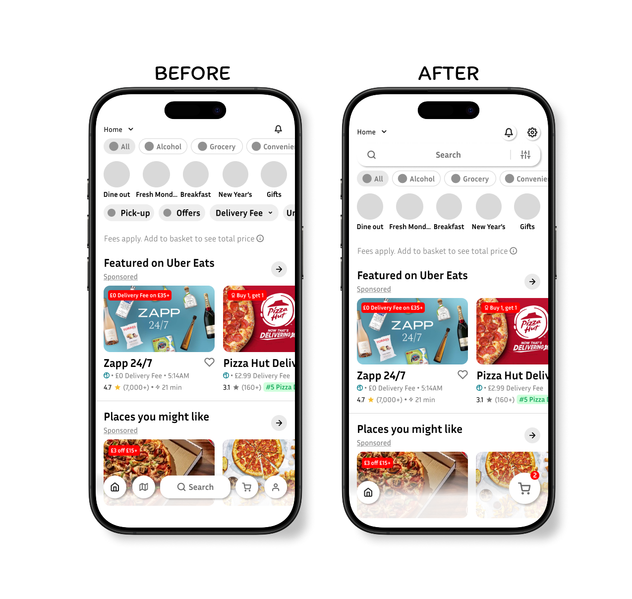
To solve this issue, I decided the removal of certain buttons and compiling some buttons into one button would be the best course of action. This would in turn unclutter a large amount of space and produce less confusion, making the app easier for all ages and experienced users.
Design Decisions
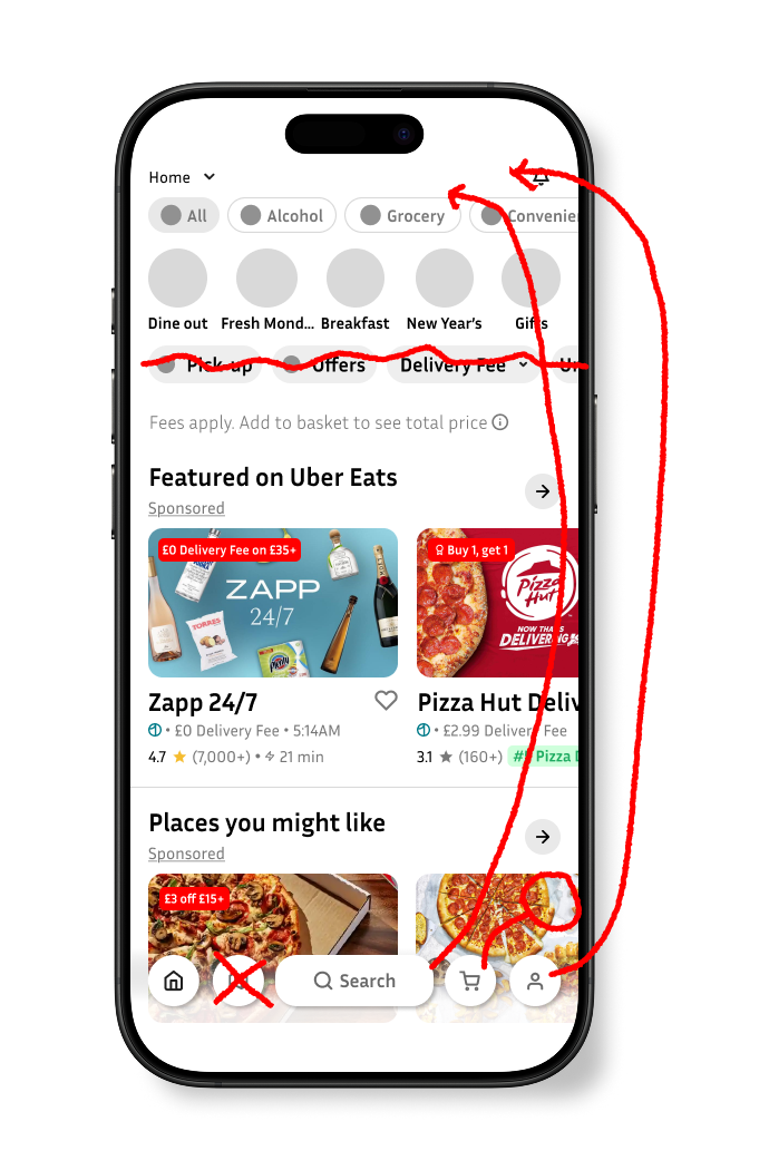
To remove and replace the buttons above the fees apply text with a list icon, as this would remove all the cluttered scrollable buttons at the top.
To move the search bar to the top of the screen, bringing more convenience to the user and intuitiveness.
To remove the map icon at the bottom of the screen as I personally believed this feature wasn’t necessary due to the app already showing you the top results of what restaurants are close by when searching for a specific dish.
To move the basket button to the right of the screen and make it bigger to insinuate to the user of their final destination once ready to checkout.
To change and move the icon of the settings menu to communicate a general indication of where you can change all in app functionality.
Reflection
Throughout the development of this design, one thing that I am proud of that went well was the design of the preference bar being connected to the search bar and being placed at the top. I believe this was a core improvement on the main problem I was trying to solve.
However, what didn’t go so well was my initial design idea. Before coming up with the preference button next to the search bar, I first wanted to design a radial button that would open and show all the preferences, however I later scrapped this idea as I believe I was trailing away from the core design and theme of the app, as no where else in any of the other screens is radial buttons used.
Finally, what I believe I can improve on is definitely my methodology. Beginning this design, my structure of research and application was slightly jumbled up, I felt at times I was going back and forth between research and application rather than having a straight path from A to B.


