Monzo App Activity Screen
Remake and Redesign
Year
2026
Type
Personal Project
Project Overview
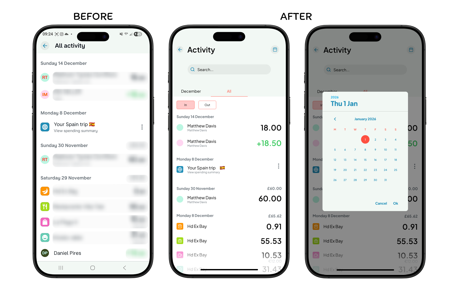
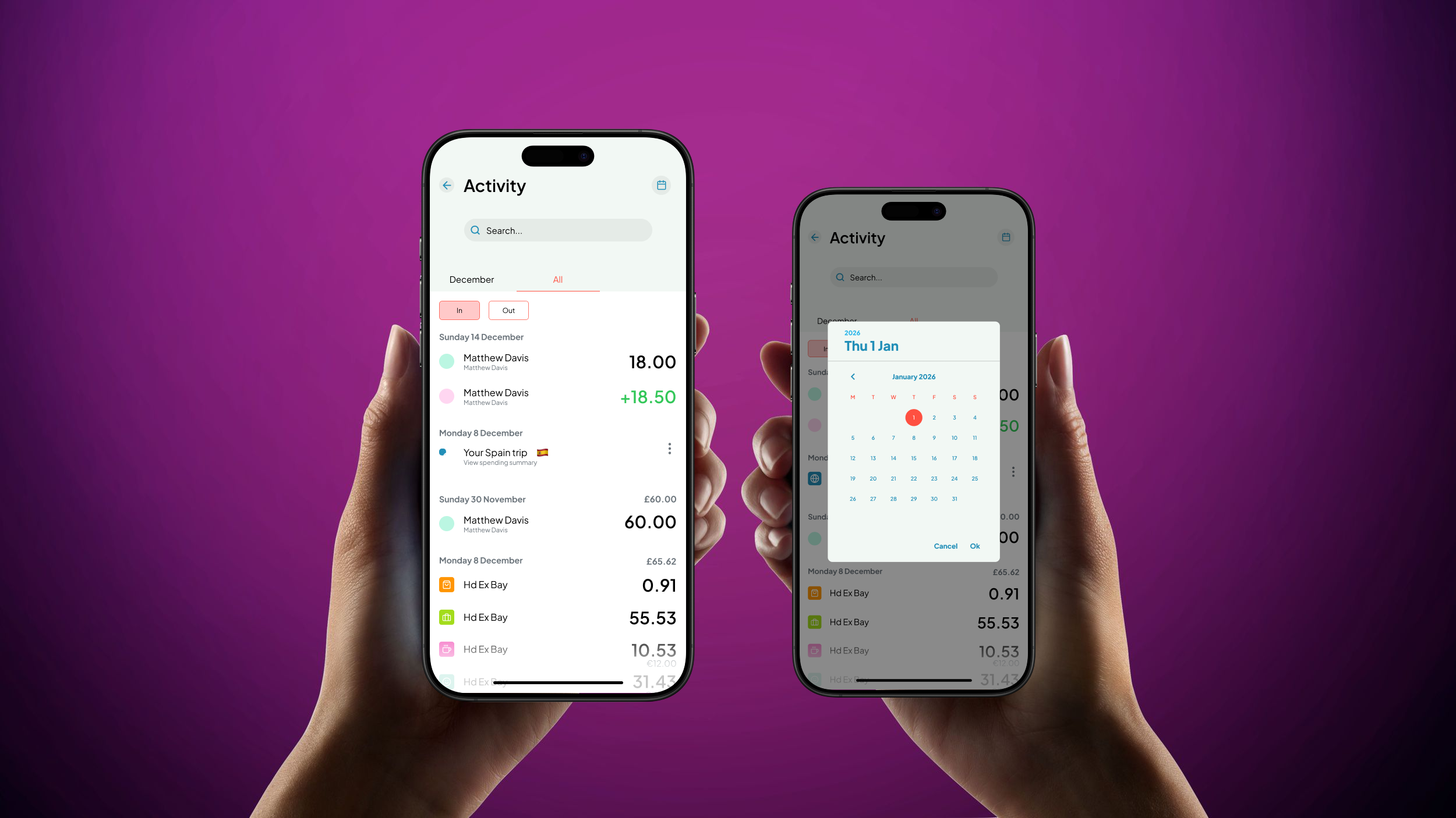
For this task, I used the Monzo app and remade and redesigned the “all activity” screen and created an entirely new pop up screen using the theme of the app. This was all made to focus on building my critiquing and UX skills, really asking myself, what would the user be here for? And what would the user need?
Problem
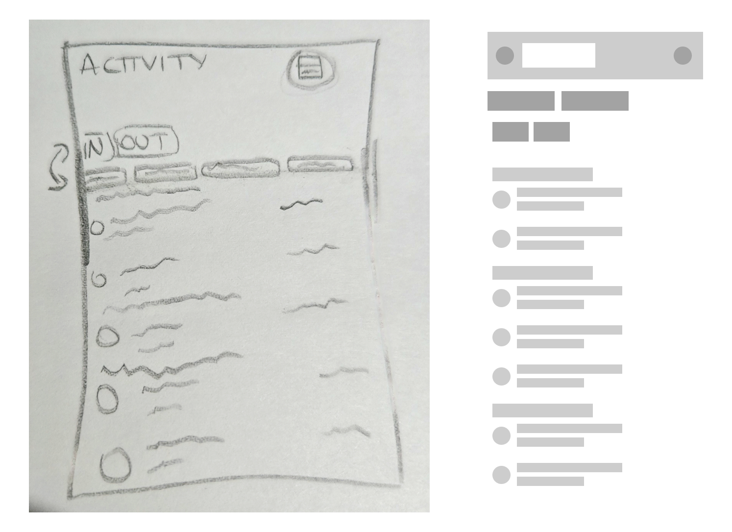
When traveling to this screen, the first thing I found inconvenient and inefficient was the lack of filtering. The user is forced to scroll continuously down the months in order to get to their desired date rather than being able to easily select a specific month and year to go to and see their transactions.
Solution
In order to solve this issue, I believe adding side scrolling tabs where the user can select a specific month would be music more efficient. I also think adding a small calendar button at the top of the screen next to the “all activity” text would be helpful for the user if the date they’re searching for goes further than a year and so they can easily select the desired date they want to travel to. All this would in turn help speed up searching and lessen energy swiping.
Design Decisions
Changed title to “Activity” as this screen would now show activity from individual months if needed and saves space on the screen
Added an “In” and ”Out” button to filter money that’s been received and money that’s been given to others
Added scrollable tabs to swipe through all the months
Added a calendar to travel to transactions further than a year old
Added a search button in order to search for specific transactions
Considered adding a settings button but removed it as it didn’t line up with the intentions of why the user would be entering the activity screen
Reflection
One thing that worked really well when redesigning the screen, was adding the “In” and ”Out” buttons as I believe it’s a really efficient way to quickly see your transactions that have been taken and given. I also believe the colours I’ve used to show which are being selected work well with the theme as I attempted to stick to the current colours as best as possible.
What didn’t work as well was adding a settings button. Initially, I wanted there to be a settings button next to the calendar button, however I later scrapped this idea as when I rethought the intention of the user, I came to the conclusion it was unlikely they would enter the activity screen in order to see their settings, so to save space, I removed it.
What I would do next to improve this design would be to add animations or some type of interactive flow to showcase better. This will most likely be something I add in the future when returning back to this project.